USING URBAN COLORS TO RESHAPE THE SPIRIT OF PLACE
In my design project, I propose a City Color Museum to celebrate Riga’s unique urban color palette. During Studio A, I analyzed the city’s color composition through a blend of geographical and psychological perspectives, identifying a spectrum that reflects the essence of Riga. In Studio B, I applied this color palette to a planning scheme for Kipsala, an island situated between Riga’s historical center and its growing urban district, overlooking the Daugava River. The goal was to create a color park that evokes a collective memory of Riga, integrating the city's lifestyle and needs.
For Studio C, I designed the City Color Museum, emphasizing how architecture can convey the significance of urban colors. After selecting a site, I studied Riga’s urban texture, which is fragmented and organic. Using a method inspired by urban planning literature, I generated multiple massing blocks by throwing them onto a site map and analyzing the resulting spatial relationships. Adjustments were made to establish the museum’s form and height based on the surrounding buildings.
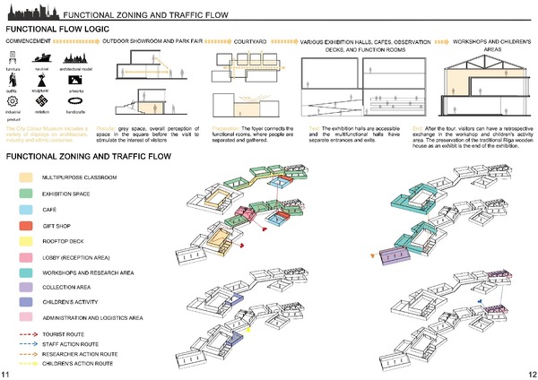
The interior layout follows a clear circulation strategy, inspired by the China Design Museum, ensuring distinct visitor flows through reception areas, exhibition spaces, and amenities like a café and gift shop. Separate entrances and spaces are designated for staff, researchers, and children to avoid circulation conflicts. Outdoor areas include a playground, exhibition zones, and a plaza, with the parking lot at the entrance to ensure pedestrian safety.
Materially, the museum reflects Riga’s historical architecture, using wood, stone, bricks, and tiles, while the color palette incorporates hues like beige, brown, and red to resonate with the city's heritage.